

Confusing services, missing information, and unclear next steps can create more hesitation than you think.
There are plenty of things homeowners expect to find scary in October. A contractor website shouldn't be one of them.
But here's the uncomfortable truth: some contractor websites create more uncertainty than confidence.
Not because the design is terrible. Not because the company isn't good at what it does. And not necessarily because the website is old.
The real problem is that the homeowner has to figure things out.
What services do you actually offer? Do you work in their area? Have you done a project like theirs? Can they see recent work? How much experience do you have? What happens if they contact you? And most importantly, what are they supposed to do next?
If a homeowner has to hunt for those answers, they're not going to give your website extra credit for making them work. They'll open another contractor's website.
That's why good contractor website design isn't just about making a company look more professional. It's about removing uncertainty and making the decision easier for the person on the other side of the screen.
The Scariest Thing Isn't an Ugly Website. It's a Confusing One.
A website can look polished and still perform poorly.
You can have beautiful photography, modern fonts, animations, and a great-looking homepage, but if a homeowner can't quickly understand what you do or how to get started, the design isn't doing enough.
Think about what happens when someone needs a contractor. They aren't visiting your website because they want to admire your web design. They have a problem they want solved.
Maybe they need a roof replaced. Maybe they're planning a kitchen renovation. Maybe they need a home addition. Maybe they have storm damage and want to know what happens next.
They're looking for reassurance.
A good website gives them that reassurance quickly. A confusing one gives them more questions.
Your website shouldn't make homeowners think harder than they already have to.
Can Homeowners Tell What You Actually Do?
Start with the most basic question: if someone lands on your homepage for the first time, can they tell what you do within a few seconds?
This sounds obvious, but contractor websites often make this harder than it needs to be. Phrases like "quality craftsmanship," "building your vision," or "serving our community" may sound good, but they don't necessarily tell the homeowner what you actually do.
If you specialize in kitchen remodeling, say it. If you build home additions, make that obvious. If you focus on roofing, exterior renovations, or commercial construction, don't make someone dig through your navigation to figure it out.
Your services should be clear enough that a homeowner can immediately recognize, "Yes. This is the kind of company I'm looking for."
This is one of the foundations of effective website design for contractors. Your website architecture, navigation, and copy should reflect how people actually look for your services.
A quick test is to open your homepage and ask yourself: Can I tell what this company does immediately? Are the main services easy to find? Can I tell what types of projects they specialize in? Is it clear where they work? Is there an obvious next step?
If the answer to several of those questions is no, your website may be creating unnecessary friction.
Your Project Gallery Should Prove What You Can Do
Homeowners don't just want to know that you offer a service. They want to know whether you can actually do their project well.
That's where your project gallery becomes one of the most important parts of your website.
If your newest project photos are from three years ago, that's a problem. Not because the work is bad, but because the homeowner has no way of knowing what your business looks like today.
Your project gallery should show the kind of work you want more of.
If you want more high-end renovations, show those. If you want larger additions, feature them. If you're trying to attract more roofing replacement projects, make those projects easy to find.
And don't just upload random finished photos. When possible, give the project some context. What was the homeowner trying to accomplish? What did the project involve? What challenges had to be solved? What was the final result?
That turns a photo gallery into proof.
You're no longer simply saying, "We do good work." You're showing the homeowner what that work actually looks like.
Don't Make Homeowners Hunt for Basic Information
Here's another common website problem: the information exists, but it's impossible to find.
A homeowner shouldn't have to click through five pages to figure out whether you serve their town. They shouldn't have to search your entire website to find your phone number. They shouldn't have to guess whether you handle the type of project they're planning.
Your website should make important information easy to access.
At minimum, homeowners should be able to quickly find your primary services, service areas, recent projects, reviews, contact information, your estimate or consultation process, and relevant credentials or experience.
This is especially important for established contractors.
You've probably built a strong reputation offline over the years. But homeowners don't automatically know that when they land on your website. Your website has to communicate the reputation you've already earned.
Your online presence should catch up with the business behind it.
“Contact Us” Isn't Always the Best Call to Action
Here's something small that can make a surprisingly big difference: look at the buttons across your website.
How many say "Contact Us," "Learn More," or "Submit"?
These aren't necessarily wrong. They're just vague.
A homeowner is more likely to understand a specific next step such as Request an Estimate, Schedule a Consultation, or Discuss Your Project.
The best CTA depends on what you're asking the homeowner to do and where they are in the decision process. Someone reading a detailed service page may be ready to request an estimate. Someone reading an educational blog post may simply want to learn more. Someone looking at your project gallery may be ready to discuss a similar project.
Your CTAs should reflect that.
The goal isn't to put a giant "Buy Now" button everywhere. It's to make the next logical step obvious.
Your Website Needs to Work for Homeowners on Their Phones
Your website may look fantastic on your desktop. That doesn't mean the experience is good everywhere else.
Think about how homeowners actually search for contractors. They might be standing in their kitchen looking at a renovation. They might notice a leak and immediately search for a roofing company. They might be sitting on the couch comparing contractors after dinner.
They're not necessarily sitting at a desk with a large monitor open.
That's why mobile experience needs to be part of your contractor web design services, not something checked at the very end of a project.
Open your website on your phone and actually use it. Try to find a service, view a project, read a review, find your service area, call the business, and submit a form.
Pay attention to how much effort each action takes.
Are buttons easy to tap? Is the text readable? Does the menu make sense? Does the phone number work? Does the form feel easy to complete?
A homeowner shouldn't have to pinch, zoom, scroll endlessly, or fight with your navigation just to contact you.
Outdated Information Can Make an Established Business Look Behind
This is one of the most overlooked problems with contractor websites.
Your business changes. Your website doesn't.
Maybe you've added services. Maybe you've stopped offering something. Maybe you've moved into a new service area. Maybe your team has grown. Maybe you've completed dozens of projects since the last time anyone updated the site.
But the website still says what it said years ago.
That creates a disconnect.
A homeowner sees the website and forms an impression based on information that may no longer represent the company they're actually considering hiring.
This is where website maintenance for contractors becomes more than fixing broken links or updating software.
Ongoing website maintenance should help keep the website aligned with the business. That means regularly reviewing your services, service areas, project photos, reviews, team information, contact details, forms, calls to action, and seasonal priorities.
Your website shouldn't become a digital time capsule.
Make Your Website Answer the Questions Homeowners Are Already Asking
One of the easiest ways to make a contractor website more useful is to stop thinking only about what you want to say.
Start thinking about what your customers are already asking.
What do they ask during estimates? What questions come up repeatedly on the phone? What do homeowners misunderstand about your process? What do they worry about before signing a contract?
Those questions can become website content.
If homeowners constantly ask how long a project takes, create a process guide. If they ask what affects the price, explain the factors involved. If they ask whether you handle permits, answer that clearly. If they ask whether you work in their town, make your service areas easy to find. If they ask whether you've completed similar projects, use your project gallery to show them.
Your customers are already telling you what information they need.
The opportunity is to turn those conversations into useful content that continues working for your business after the phone call ends.
Sometimes the Problem Isn't Your Website. It's the Website Structure.
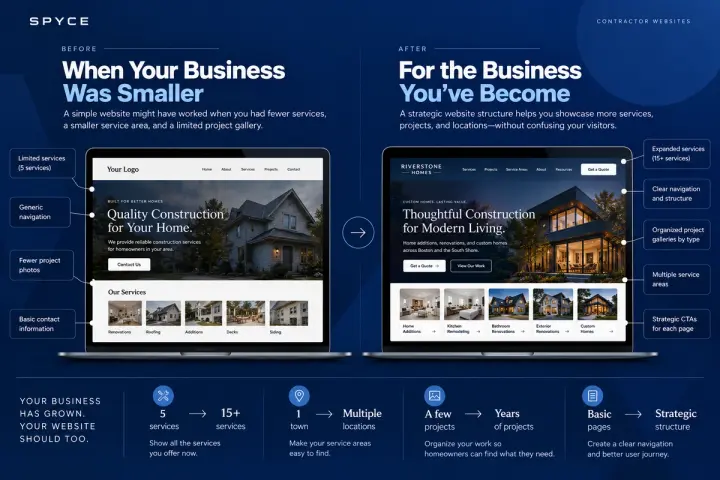
If your company has grown significantly, your website may simply have outgrown its original structure.
You might have started with five services. Now you offer fifteen. You might have started in one town. Now you serve an entire region. You might have had a handful of projects. Now you have years of work worth showcasing.
At that point, adding more information to the same old website structure can actually make things worse.
More pages don't automatically create a better website. The information needs to be organized around how homeowners search and make decisions.
That might mean creating dedicated service pages, organizing project work more strategically, improving navigation, restructuring calls to action, or simplifying the path from a Google search to an inquiry.
That's where a contractor website redesign can make sense.
But a redesign shouldn't happen just because the site looks old.
The better question is:
Is the current website still supporting the business you've become?
If the answer is no, it's probably time to rethink the structure, not just change the colors.
Good Contractor Website Design Should Make the Next Step Feel Easy
At the end of the day, your website has a simple job: help the right homeowner feel confident enough to take the next step.
That doesn't mean every visitor will call. They shouldn't. Some people are still researching. Some are comparing options. Some are months away from starting their project.
But when someone is ready, your website should make it easy.
They should know what you do, whether you can help them, where you work, what your work looks like, why they should trust you, and what happens next.
That is what separates strategic contractor website design from simply making a website look modern.
The design supports the information. The information supports the decision. And the decision leads naturally toward the inquiry.
Your Website Shouldn't Make Homeowners Guess
You don't need to scare homeowners into contacting you. You need to give them enough clarity that they feel comfortable doing it.
If someone visits your website and has to guess what services you offer, whether you work in their area, whether you've handled their type of project, or what happens after they submit a form, you've introduced friction into a decision that was already complicated enough.
Take a few minutes and look at your website like a homeowner who has never heard of your company.
Don't ask:
"Does this look good?"
Ask:
"Would I know what to do next?"
That's a much better test.
And if the answer is no, you don't necessarily need to start over. You may need better structure, better content, better project documentation, clearer calls to action, a better mobile experience, or, if the business has genuinely outgrown the site, a more strategic contractor website redesign.
The goal isn't to build a website that wins design awards. It's to build a website that reflects the quality of your business and makes it easier for the right homeowners to choose you.
Because your reputation may have taken years to build.
Your website shouldn't get in the way of it.
If your contractor website needs more than a few fixes, working with a contractor website design company that understands how home service businesses actually operate can help you figure out what needs to change, what doesn't, and where your website is creating unnecessary friction.
Ready to stop making homeowners guess?